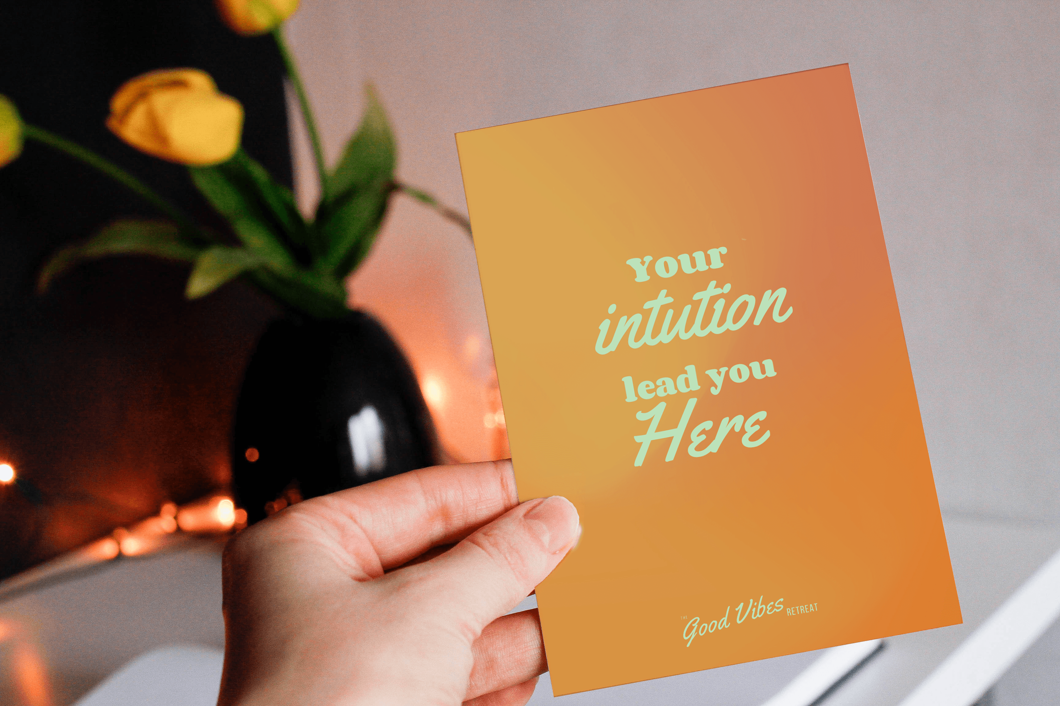
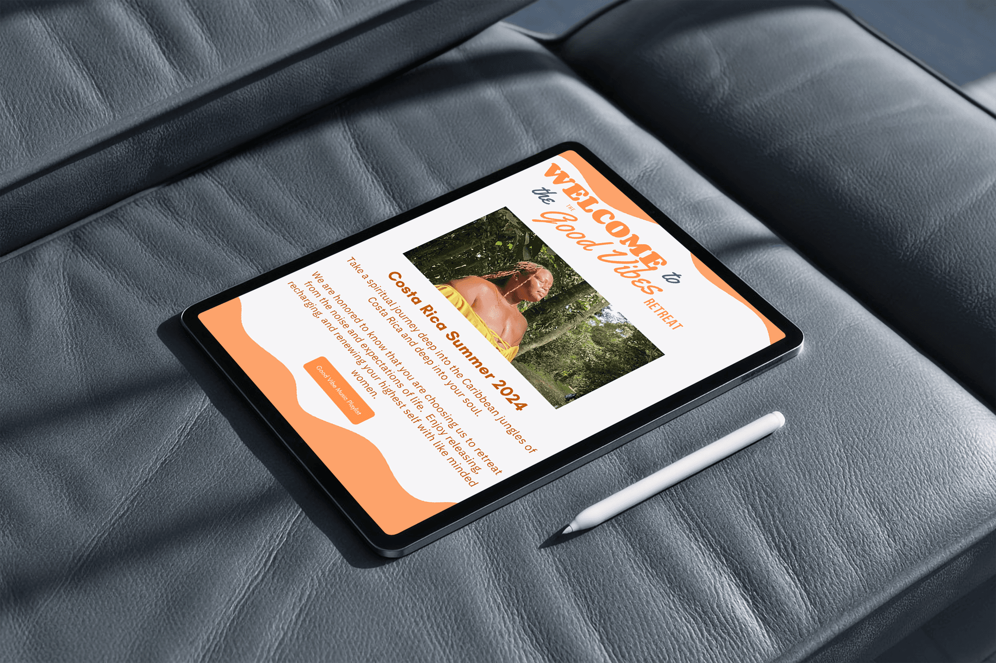
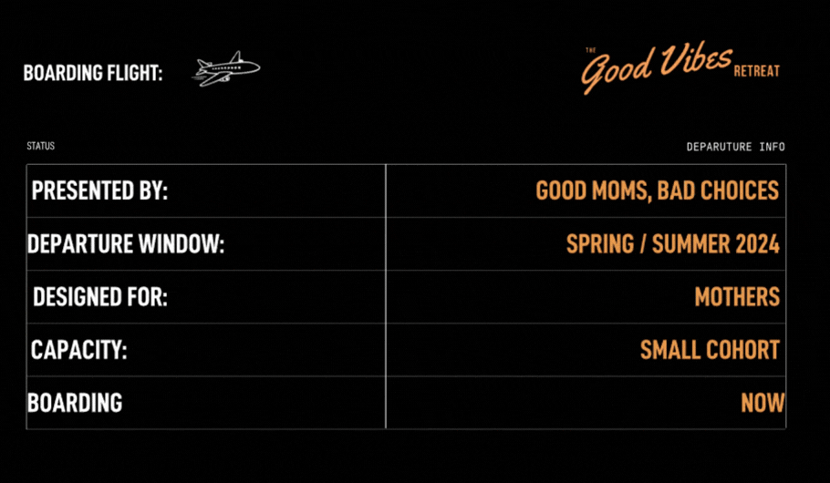
Good Vibes Retreat
Client:
Hada Madriana Production
Role:
Graphic Designer
Collaborators:
Expand for Full List
For Good Moms Bad Choices, the Good Vibes Retreat was an extension of a platform already grounded in maternal autonomy, cultural commentary, and collective care. It had a clear voice and a defined audience. What it lacked was a system capable of translating that voice into a cohesive brand and physical experience.
Experiental
Web Design

The Good Vibes Retreat is a subsidiary retreat program created by the podcast Good Moms, Bad Choices. A number one podcast, featured on spaces like the Rolling Stones and more, it was known for its sharp jargon and tell-it-like-it-is personality.

Clip of Podcast Good Moms Bad Choices with Artist, Teedra Mosses


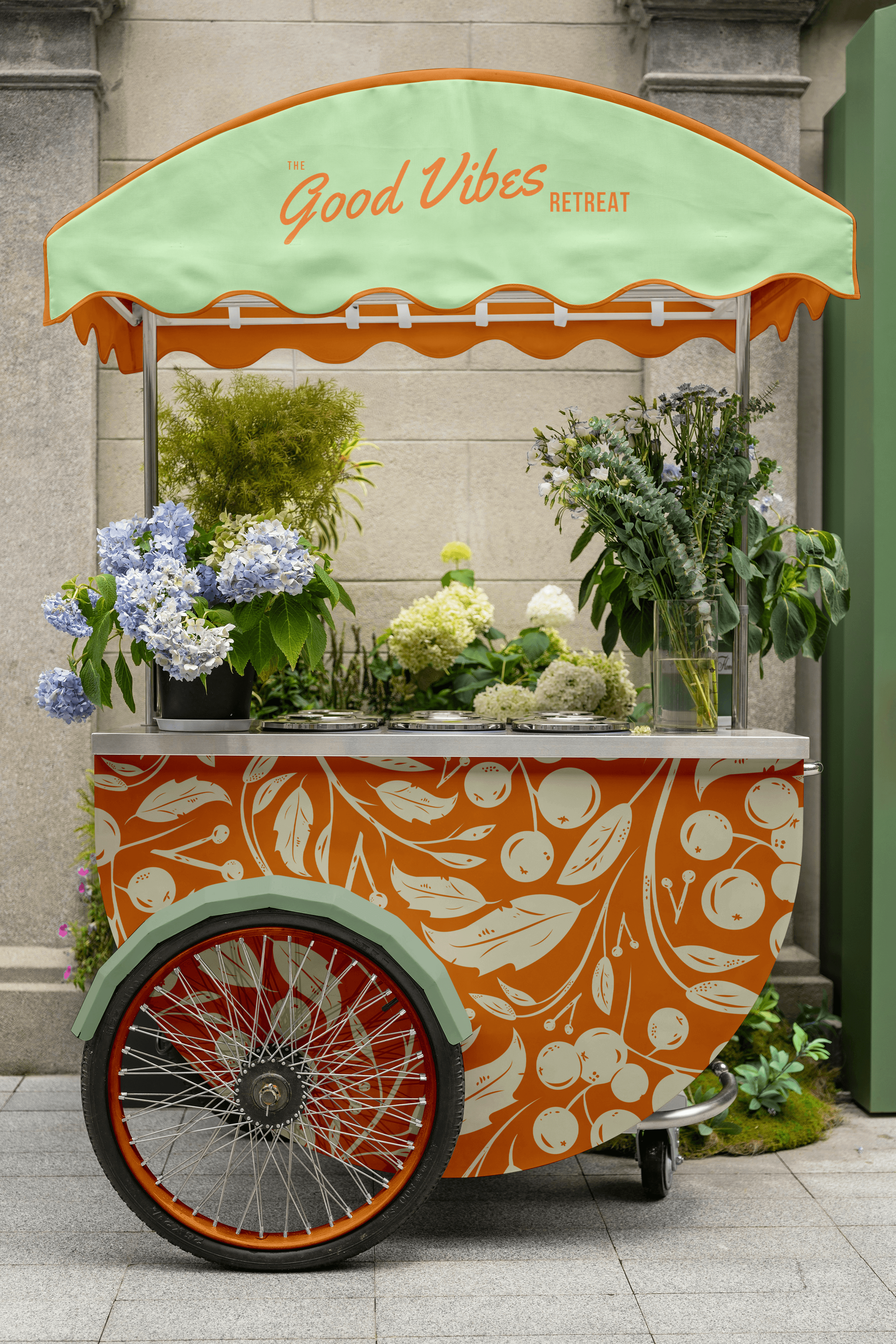


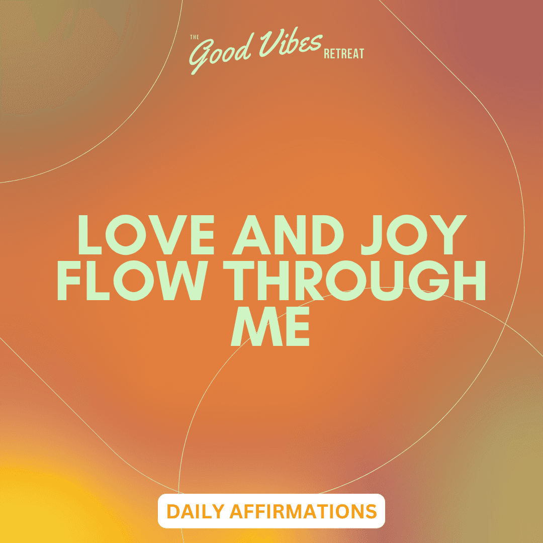
For Good Moms Bad Choices, the Good Vibes Retreat was an extension of a platform already grounded in maternal autonomy, cultural commentary, and collective care. It had a clear voice and a defined audience. What it lacked was a system capable of translating that voice into a cohesive brand and physical experience.
Good Vibes Retreat
Janay Davison — Art Director