Pilecki Institute USA
Client:
Ministry of Poland
Role:
Art Director
Collaborators:
Expand for Full List
The Pilecki Institute USA launched as the first American branch of a European institution, entering a new market without an established identity. The challenge was to create a system that could remain structurally aligned with branches in Warsaw and Berlin while adapting to the cultural, institutional, and operational demands of a U.S. market.
Brand Identity
Spatial Design
Digital Design

The Witold Pilecki Institute of Solidarity and Courage is a Polish state institution dedicated to documenting the history of 20th-century totalitarianism through exhibitions, research, and public programming.
Pictures taken of The Augustów Roundup and Its Aftermath: The Current State of Research and Proposals for the Future in Augustów


The Institute also commemorates individuals who demonstrated courage and solidarity in helping others during times of persecution through honors such as the Virtus et Fraternitas Medal.
Ahead of its presentation at the United Nations, coordinated production with U.S. print partners to realize the Lemkin Exhibition following its transport from Poland.

In 2026, the Institute will open its first U.S. branch at 92 Greenwich Street in Manhattan — its third location, after Warsaw and Berlin.


0:00/1:34
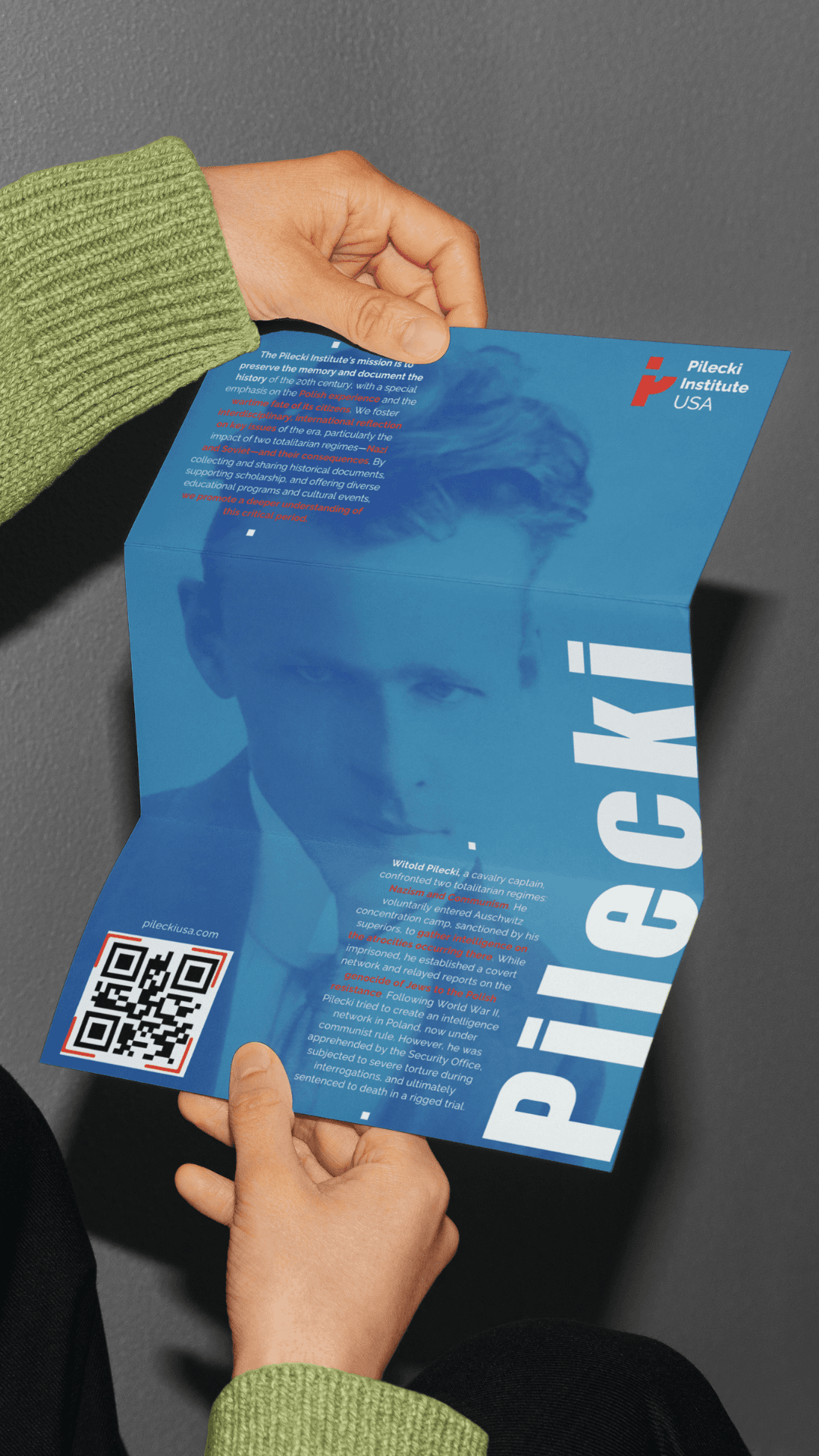
The institute takes its name from Witold Pilecki (1901–1948), a Polish army officer who in 1940 voluntarily entered Auschwitz to organize a resistance network and document Nazi atrocities for the Allies..

Witold Pilecki Standing in Front of the Jury.

The interior design system was rooted in natural textures and materiality — a sensibility that carries through the broader brand identity. My contribution focused on ensuring conceptual continuity between the spatial direction and the visual identity system, maintaining coherence across both environments.


The color system is derived from the architecture of Poznań Old Market Square — reds, blues, teals, and greens pulled directly from its facades. Each tone was desaturated to achieve a palette that carries cultural specificity without literal reference, balancing Polish heritage with the restraint appropriate to an institution focused on difficult history.


The institutional mark was deconstructed into modular forms and reassembled as a repeatable graphic system for merchandise and environmental applications. The pattern functions independently while remaining tethered to the broader identity, extending the brand into physical and retail contexts without diluting the primary mark.


PREVOUS PROJECT
For its first U.S. location, the Pilecki Institute needed an identity that could translate its rich European legacy into a clear, contemporary presence. The result is a system shaped by narrative, materiality, and accessible design, creating an environment where history becomes approachable, relevant, and alive for New York audiences.
Pilecki Institute USA.
Pilecki Institute USA.
Janay Davison — Art Director


Janay Davison — Art Director
Pilecki Institute USA.
For its first U.S. location, the Pilecki Institute needed an identity that could translate its rich European legacy into a clear, contemporary presence. The result is a system shaped by narrative, materiality, and accessible design, creating an environment where history becomes approachable, relevant, and alive for New York audiences.