Awkward Converstations
Client:
Hada Madriana Production
Role:
Graphic Designer
Collaborators:
Expand for Full List
Awkward Conversations set out to make parents feel less alone.
A social media identity that leads with empathy before expertise — turning a podcast about difficult conversations into a brand that feels like one.
Social Media Brand Refresh

Awkward Conversations is a podcast that helps parents navigate difficult discussions around substance use, addiction, and adolescence.

Through conversations with psychologists, educators, and people with lived experience, the podcast offered expert guidance on some of the most emotionally complex moments of parenting .
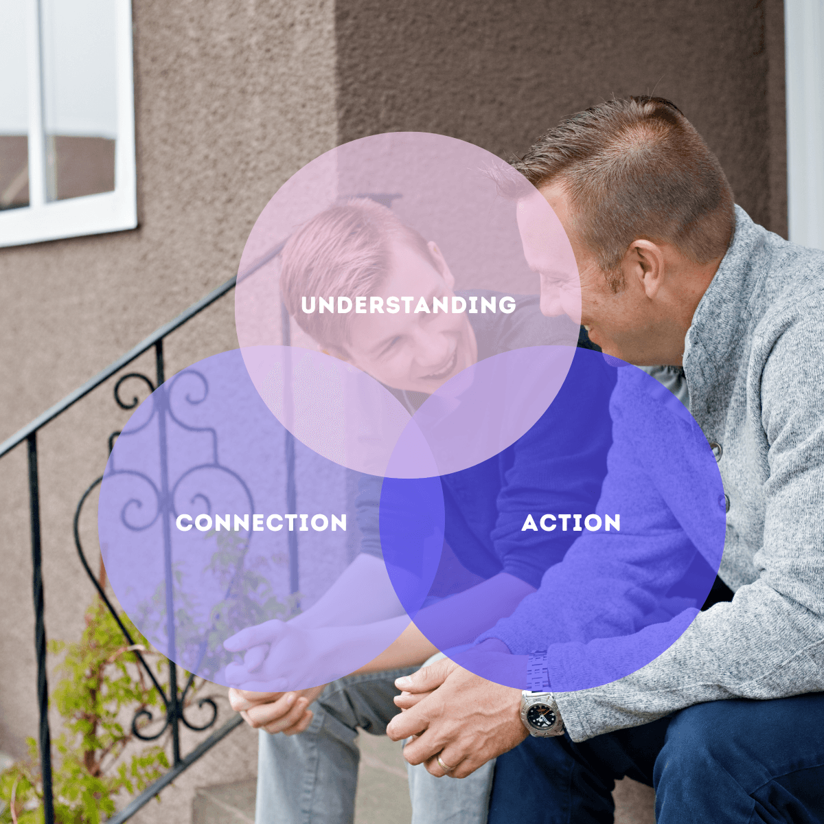
Content was reorganized around three complementary roles
Rather than treating education as a destination, the system treats it as something that naturally follows trust.

The verbal identity shifted from instructional messaging toward conversational guidance. Instead of presenting answers immediately, the brand first validates the emotional reality parents are experiencing—creating space for reflection before action.
Typography, hierarchy, and composition were intentionally simplified to reduce cognitive load. Spacious layouts create moments to pause rather than overwhelm, allowing difficult information to feel approachable instead of intimidating..


Photography shifted away from idealized images of family life toward quiet moments of genuine connection, reinforcing the brand's role as a companion rather than an institution.


Together, these elements create an identity that feels less like an organization delivering information and more like someone sitting beside you through a difficult conversation.
The redesign extended beyond aesthetics into the behavior of the brand itself.
Every touchpoint begins with empathy before expertise.
Messaging acknowledges uncertainty instead of assuming confidence. Calls to action invite participation rather than demand it. Educational content is framed through encouragement instead of authority.
The result is an experience that replaces judgment with reassurance and information with conversation.
Rather than asking parents to meet the brand where it is, the brand meets parents where they are.




Gradients became a central element of the identity—not simply as an aesthetic device, but as a metaphor for emotional complexity. Overlapping colors reflect the reality that parents often experience conflicting emotions at the same time: fear alongside hope, uncertainty alongside resilience, vulnerability alongside strength.

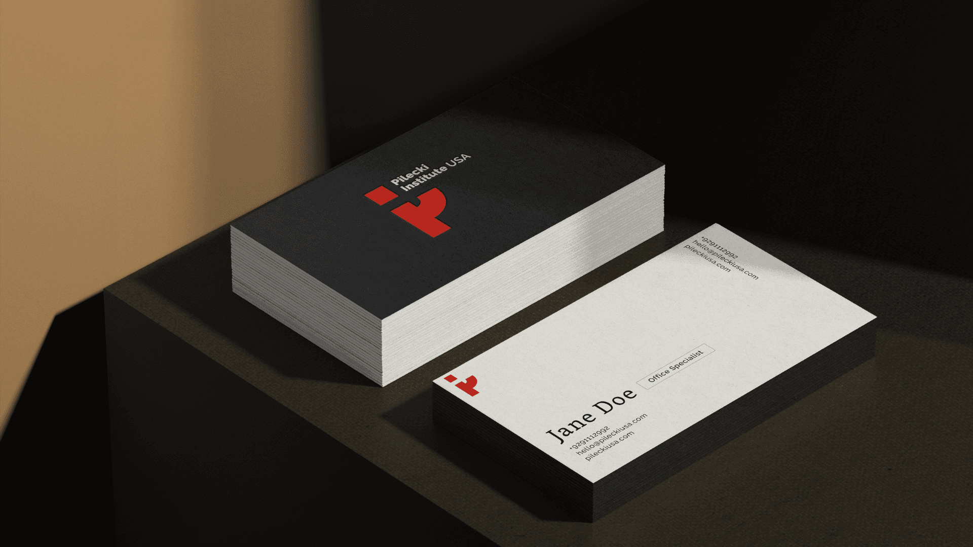
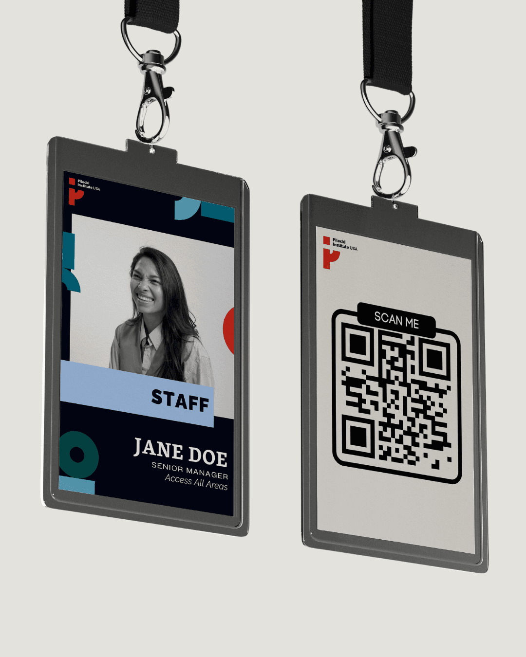
Pilecki Institute USA



Awkward Converstations
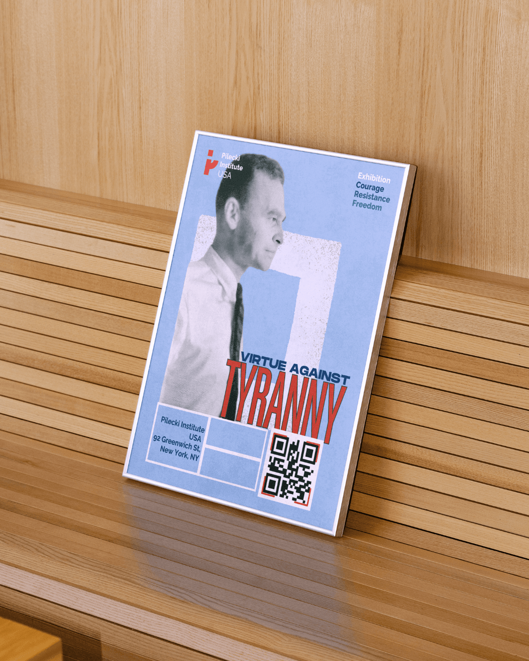
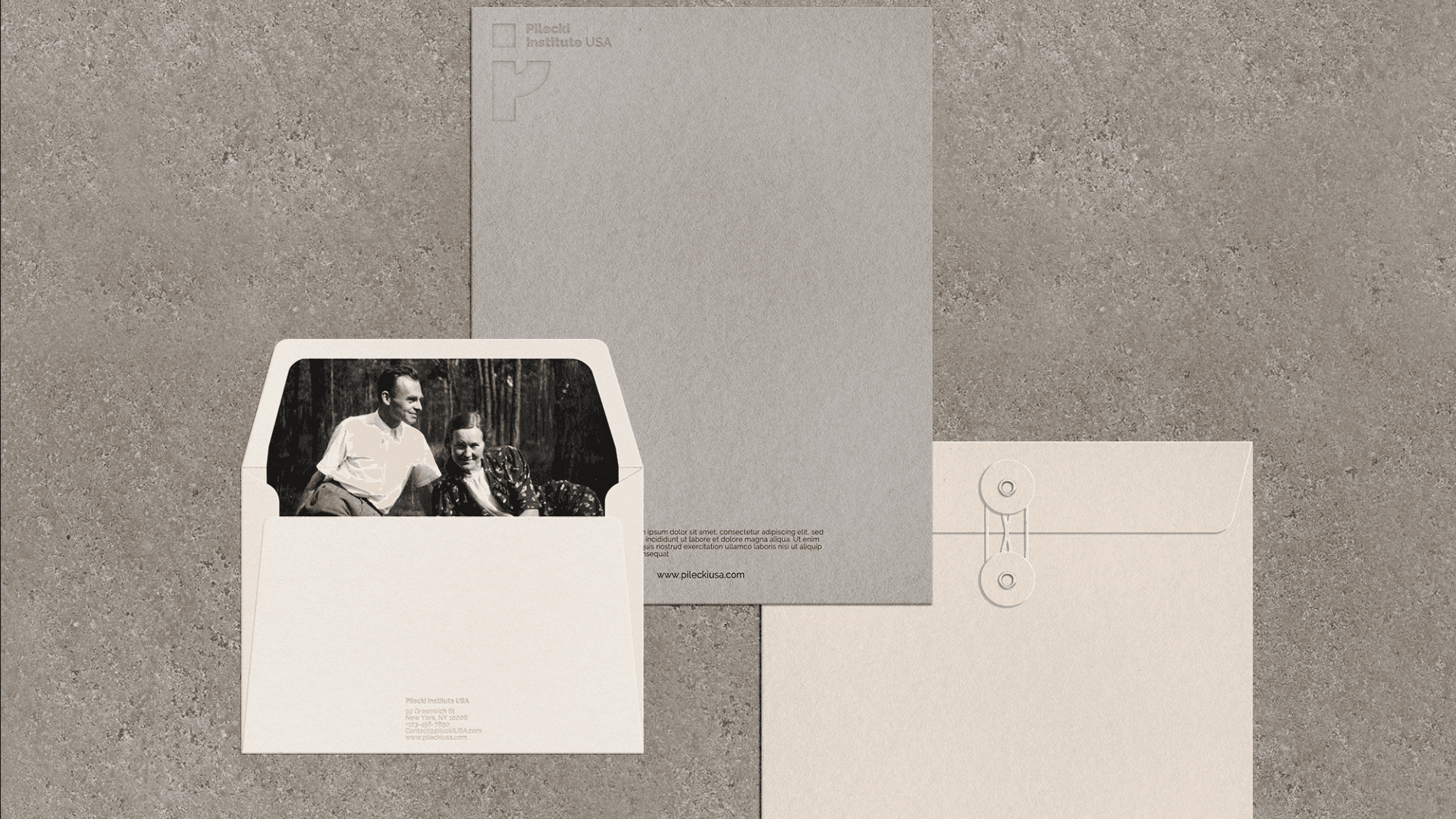
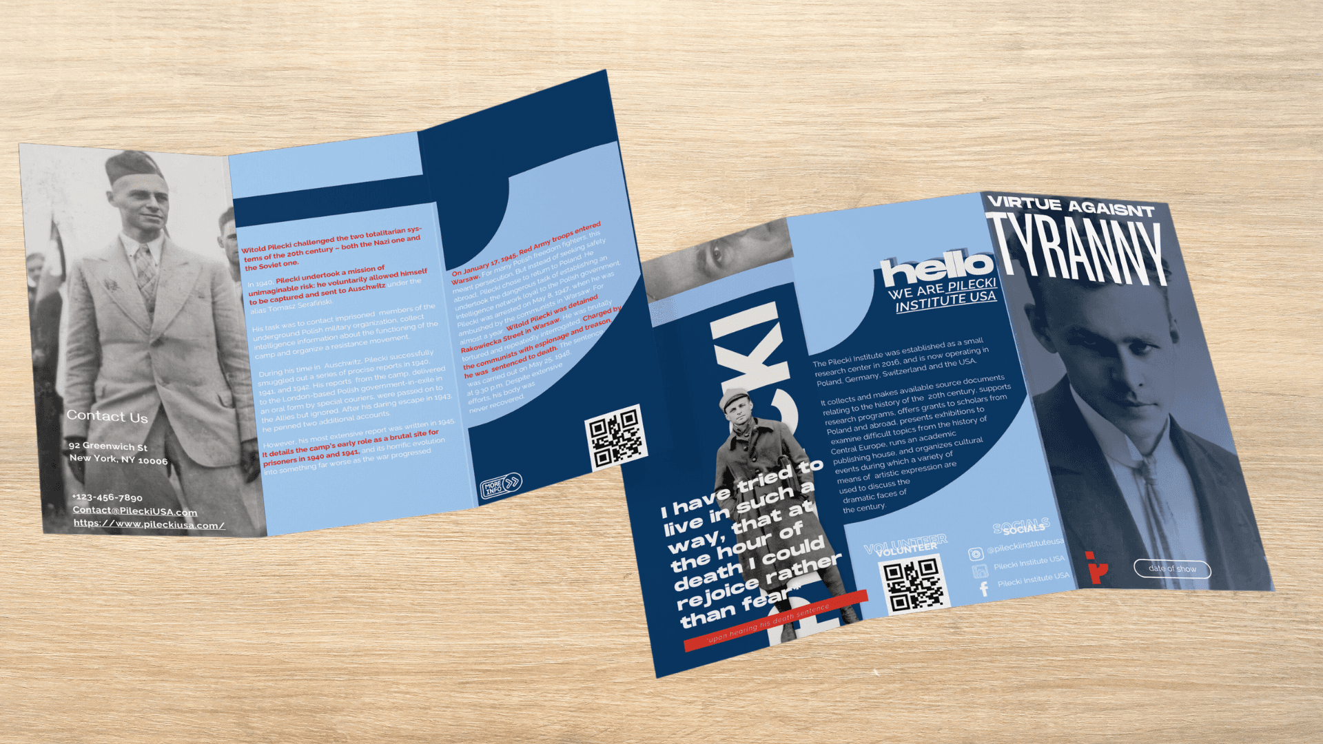
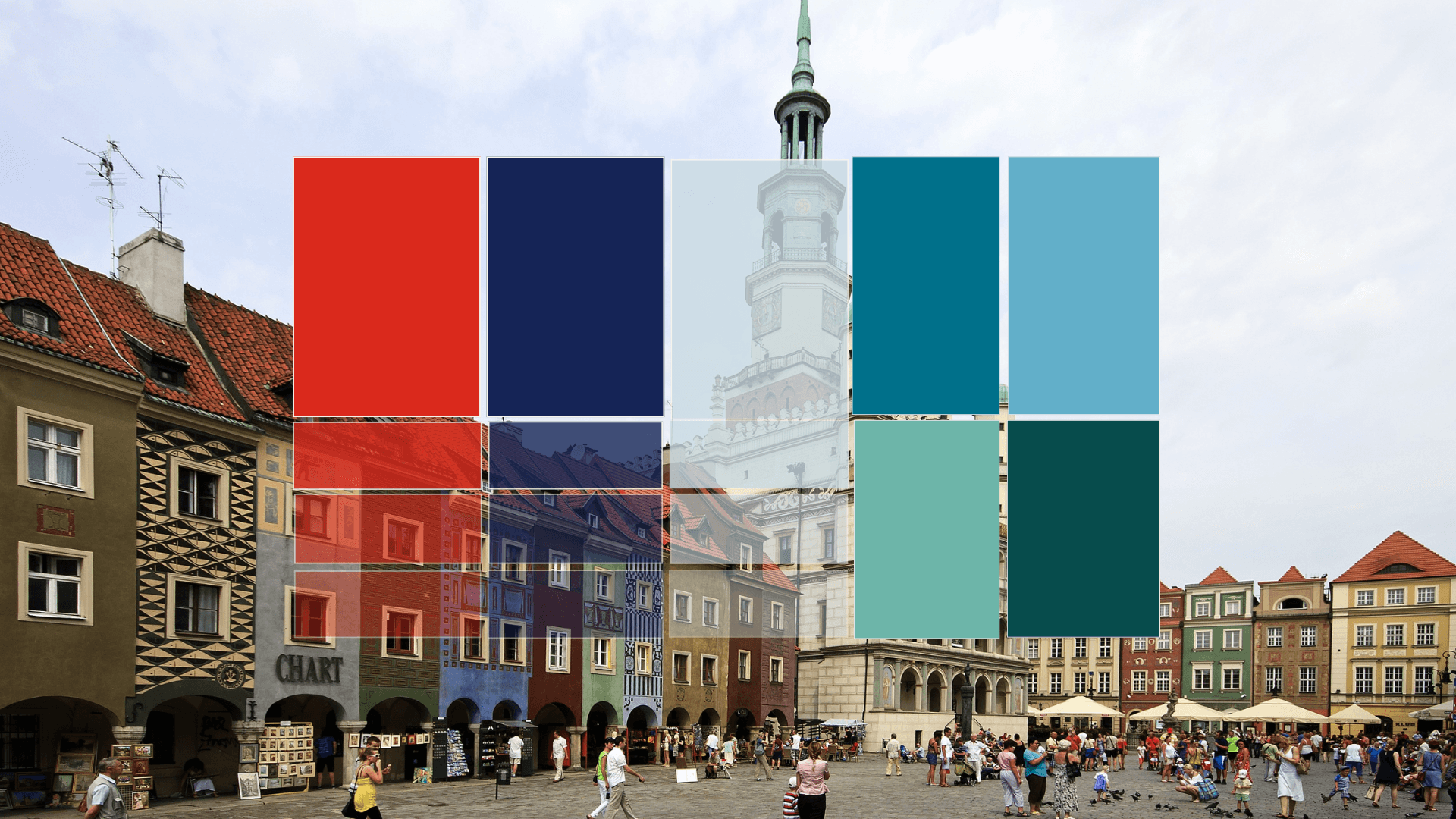
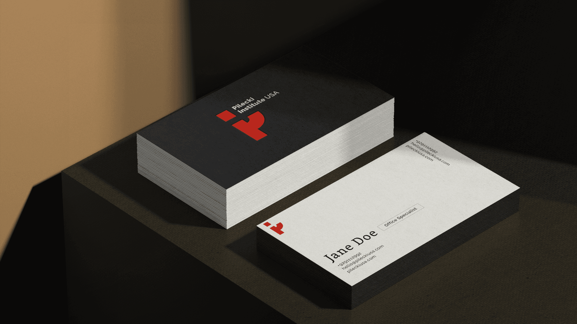
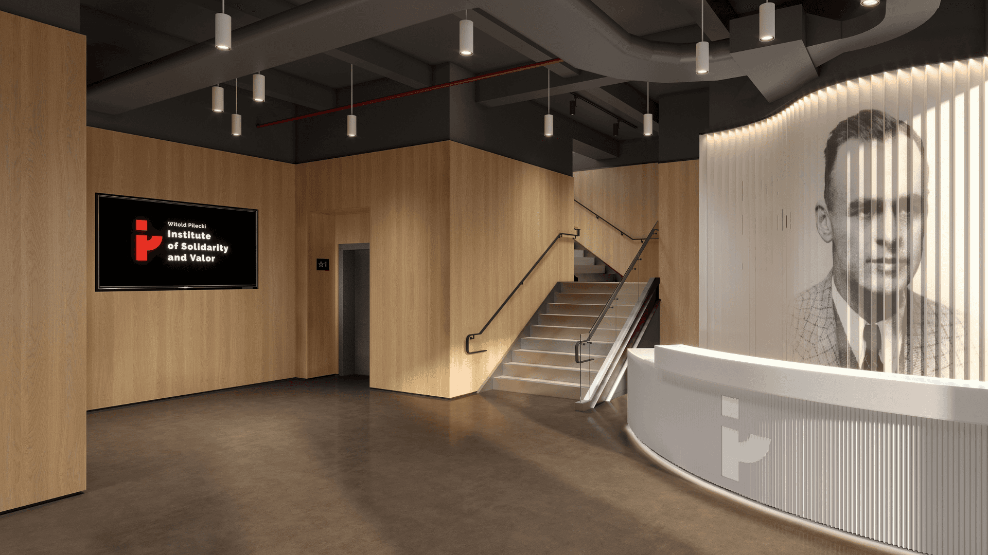
For its first U.S. location, the Pilecki Institute needed an identity that could translate its rich European legacy into a clear, contemporary presence. The result is a system shaped by narrative, materiality, and accessible design, creating an environment where history becomes approachable, relevant, and alive for New York audiences.
Pilecki Institute USA
Awkward Converstations
For its first U.S. location, the Pilecki Institute needed an identity that could translate its rich European legacy into a clear, contemporary presence. The result is a system shaped by narrative, materiality, and accessible design, creating an environment where history becomes approachable, relevant, and alive for New York audiences.